
How to create advanced charts with no code
Information gathering and analysis are essential for many companies and organizations in today’s data-driven environment. The latest method of data collection and employee or customer feedback gathering is through online forms. Perhaps it’s because of how easy and enjoyable they can be.
.png)

Information gathering and analysis are essential for many companies and organizations in today’s data-driven environment.
The latest method of data collection and employee or customer feedback gathering is through online forms. Perhaps it’s because of how easy and enjoyable they can be.
To get something out of the data, it must be organized and understood; gathering data alone is not enough.
In this post, we’ll discuss the significance of categorizing online data sources as well as how charts and reports may offer insightful information and guide decision-making.
Benefits of charts and reports on decision-making
Beyond just exhibiting the raw data, displaying the information gathered from form submissions in charts and reports can have further advantages. It is simpler to spot trends, patterns, and linkages by visualizing the data than it may be to do so by simply glancing at a spreadsheet or database.
When dealing with enormous datasets or complex information, this can be quite helpful.
Charts and reports can also be used to help stakeholders who might not be familiar with the technical nuances understand the data more clearly. Even non-experts can more easily understand and evaluate the data when it is presented visually. When providing the facts to upper management, investors, or outside partners, can be very crucial.
Besides that, charts and reports can be adjusted to highlight particular details in the data, making it simpler to concentrate on the most key details. A chart, for instance, might be used to compare the outcomes of several survey questions or to demonstrate how responses vary by demographic group.
This can help to highlight problem areas or provide guidance for upcoming decisions.
Ultimately, there are several advantages to showing the information gathered from form submissions in charts and reports, including better comprehension, communication, and decision-making. Data visualization simplifies the process to spot trends and patterns and effectively convey information to a variety of stakeholders.
Formaloo: The smart way to build forms and visualize data with advanced charts
Formaloo is a highly flexible online form builder designed to help businesses produce top-notch forms tailored to their needs.
With its user-friendly editor, users may create forms that include various question types, including text, multiple-choice, single-choice, tables, and rating scales.
With Formaloo’s form design customization tools, which include the capacity to integrate images, videos, and logos, creating a form that is expert and consistent with your brand is straightforward.
Learn how to further customize your forms.
With the help of Formaloo’s domain customization and white labeling options, users can change the look and feel of their forms. In addition, Formaloo offers users the chance to design email templates that meet company needs and alter email notifications to suit their branding.
With the data gathered through their forms, portals, and business apps, businesses may learn valuable lessons thanks to Formaloo’s comprehensive reporting capability.
You can develop bespoke reports according to your company requirements using Formaloo’s reporting dashboard or use pre-built reports.
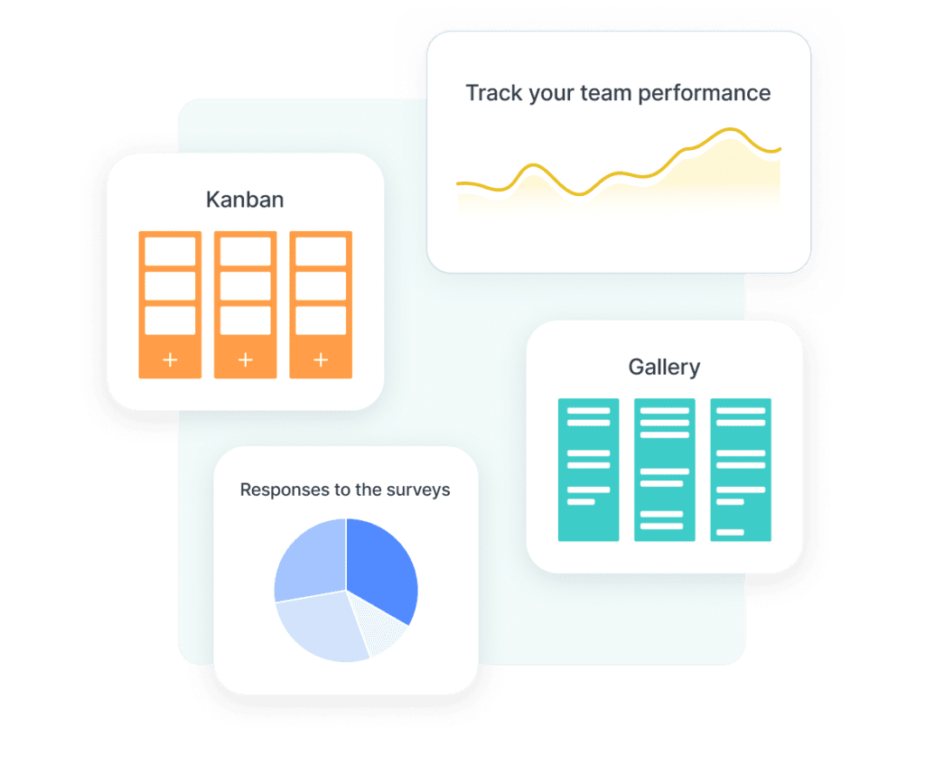
The reporting function offers real-time data analysis, enabling companies to spot trends, patterns, and opportunities for development. Data visualization tools like charts, graphs, and Kanban boards are also included in Formaloo’s reporting, making it simpler to filter and segment the gathered data.
How to create custom advanced charts in Formaloo
Forms are a great way to improve customer engagement and gather important information for your business. It is, though, not enough.
The raw data you gather from the form and survey submissions won’t help you to make informed decisions.
Charts, graphics, and images are excellent ways to visualize and represent data, and Formaloo does precisely the same for us by generating the charts automatically.
You can use this advanced report template and customize it to your needs.
If you want to compare many sets of data on the same chart, you can start by creating your basic chart with just one set of data. But sometimes, you want to go beyond visualizing a dataset in a table. Advanced charts are all about this.
There is no way to outline every single chart you could create with Formaloo because there are so many chart kinds and ways to combine them.
We’re going to choose one slightly more complicated chart and concentrate on producing it to get you rolling up your sleeves and getting things done.
Step1: Create your custom form
If you still don’t have an account in Formaloo, sign-up for free and start creating your first formaloo.
Select one of our 200+ templates or create one from scratch.
In our case study, we will create a form to track events’ budgets. Then you can make an app out of it and organize the charts and tables in one folder.
Follow these steps to create your app:
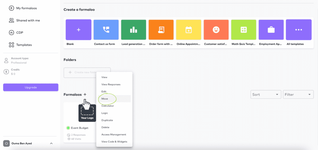
- On your dashboard, create a new folder for “Event budget tracker“.
- Right-click on your formaloo and move it to the folder you just created. You can also start building your form inside the folder by clicking the “+” sign.
Step2: Gather the data through your custom form
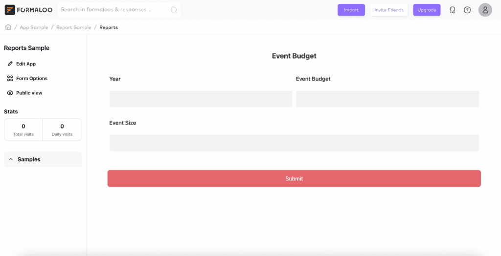
The event budget formaloo contains three text fields to add the budget, the size, and the year of your event.
This way, you can update that form with all your events and track their budgets over the years.
You can also import your previously gathered data from Google Sheets or Excel. Also, the 2-way sync option helps you automatically update data in two systems – your form and your sheet – in real-time.
Step3: Create advanced charts and reports
- Click on the “Event budget” form to start adding charts and tables for your data. Click on “Edit the app” and “Add Page“
- Choose “Block” as the item tab you will create
- Let’s name it the “Event budget over time” chart
- On the “Choose the table” dropdown menu, select the form you want to show the data from. In our case, it’s the “Event Budget“
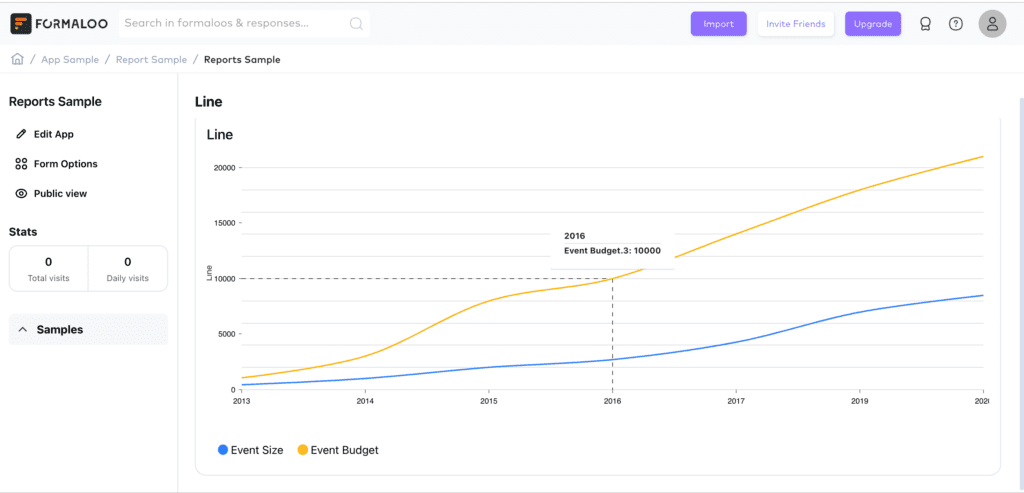
- Select “Show Data” then “Advanced chart” and choose from the chart types: Line, Bar, or Pie chart
- Select X-Axis: The base of the chart: Select 1 field as the X-Axis of the chart. Example: the event budget.
- Select Y-Axis(s): Select 1 field (or more) to showcase in the chart. Example: the year of the event.

This way, once you save, you will get a chart that compares your budgets over time. You can add as many fields as you want to compare different variables and get the full picture of your data.
The supported fields to compare are Numbers & numbered results fields (NPS, CSAT, Boolean) & the choice fields (Single, Multi, Like, dislike & dropdown).
That’s it. You have your advanced charts in a blink of an eye. You can add your team members to your Formaloo workspace to collaborate. Add different access levels for each team member and choose to show only specific responses for each.
Learn more about how to manage your team’s access levels.
How to best use the advanced charts
If you want to make the most of your advanced charts in Formaloo, it’s essential to consider your audience and keep the chart’s goal in mind. Choose the right kind of chart and adjust it as needed to make it match the data you are displaying.
By using clear labels and titles, you may make it simple for your audience to understand the key elements.
Remember to take advantage of all the features Formaloo has to offer, such as custom colors, fonts, and chart types, to create charts that truly stand out.
Follow us on our Youtube channel to receive more useful tips & tricks.


