Unsplash, per-page covers, and a cleaner dashboard.

Adding a stock photo to a form meant leaving Formaloo, finding the image somewhere, downloading it, and uploading it back. For form cover photos, field banners, background images, content blocks, and app covers, you made this trip every time. This release changes the image experience across the board, and brings several other visual and navigation improvements alongside it.
Unsplash: search photos without leaving the form

Formaloo now integrates with Unsplash. Anywhere you set an image in a form or app, you see a two-tab picker: Upload and Image. The Image tab searches Unsplash's full photo library. Type what you need, browse the results, click a photo. It is applied immediately.
This works across every image surface: form cover photo, form banner, field cover images, background images, content fields, and app covers.
What has changed:
- Image picker now has two tabs: Upload (existing experience) and Image (Unsplash search)
- Unsplash search is available wherever images can be set: form covers, banners, field covers, background images, content fields, and app covers
- Search returns results from the full Unsplash library in real time
- Selecting an Unsplash photo applies it immediately without downloading to your computer first
- Unsplash attribution guidelines are followed automatically
Multi-select dropdown field
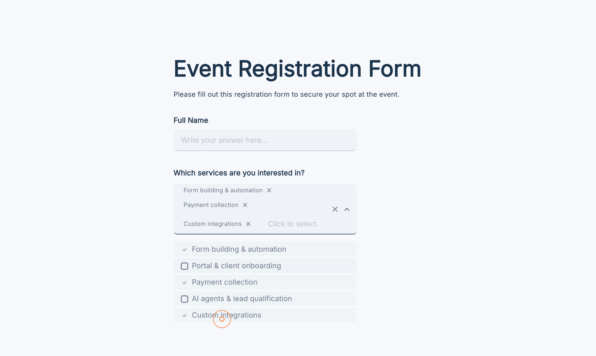
Dropdown fields let respondents pick one option from a searchable list. Multi choice fields let them pick multiple options but have no search. If you needed both, a compact, searchable field where respondents can pick more than one option, there was no native answer.
The Multi-select Dropdown field closes that gap. Add it from the Choice section of the field picker, positioned after Dropdown and before Yes/No. In form view, respondents click the trigger to open a dropdown with a live search input at the top. Selections appear as chips inside the trigger, each with an × to remove them. Once any choice is selected, the open dropdown splits into two labeled sections: Selected options at the top, All options below.
Set Min and Max selectable options in the field settings - validation messages appear inline if a respondent submits below the minimum or tries to exceed the maximum. Responses appear as colored pill chips in the data block, exactly like Multi choice. Export, webhooks, and answer piping all work with the same dash-separated format Multi choice uses.
What has changed:
- Multi-select Dropdown field available in the Choice section, after Dropdown and before Yes/No
- Respondents can select multiple options from a searchable dropdown; no download or extra step
- Selected options appear as chips inside the trigger, each with × to deselect
- Open dropdown splits into Selected options and All options sections once any choice is selected
- Min and Max selectable options setting, with inline validation messages for both limits
- Answer piping outputs selected labels as a dash-separated string in the order the respondent selected them
- Bar chart on this field shows selection frequency per option across all responses
- Conditional logic supports is, is not, is answered; import and CSV export use dash-separated format
Cover images per page in Classic forms
Classic forms had one cover image for the whole form. Now each page can have its own.
While editing a Classic form, navigate to any page and set a cover image for that page from the banner area. This is the same upload and Unsplash search experience you already know from 1QAT forms. When respondents reach that page, they see its cover. If the page has no cover, it falls back to the form-level cover image. If neither is set, no banner is shown.
Cover images follow their page if it is reordered. Duplicated pages copy the original's cover. Removing a page cover image returns the page to the form-level fallback. See recommended cover image sizes for best results.
What has changed:
- Each page in a Classic form can have its own cover image, set from the banner area in the form editor
- Uses the existing
cover imageproperty on the Page field - no new property introduced - If a page has a cover image, respondents see it when they reach that page
- If a page has no cover image, the form-level cover image is shown as a fallback
- If neither the page nor the form has a cover image, no banner is displayed
- Cover images stay attached to their page when pages are reordered
- Duplicating a page copies its cover image
- Removing a page cover image cleanly reverts to the form-level image
Ending pages: cover image and logo
Ending pages now support their own cover image and logo, matching the visual format of the welcome page. Previously, ending pages had limited design control and looked noticeably different from the rest of the form. Now they follow the same layout structure from start to finish.
For guidance on setup, see how to add a logo to your form and recommended cover image sizes. To personalize what ending pages say based on responses, see AI-personalized ending pages.
What has changed:
- Ending pages can display a custom cover image
- Ending pages can display the form logo
- Layout matches the welcome page format
- Existing ending pages are not affected unless a cover image or logo is added
Your forms, listed in your dashboard
Forms now appear directly inside folders in the dashboard. Previously, forms were only accessible by opening their project. Now, in every folder that contains forms, those forms show up alongside sub-folders and projects. No extra navigation step.
What has changed:
- Forms appear directly in the folder view of the dashboard, alongside sub-folders and projects
- Every folder that contains forms shows those forms without requiring a click into a project
- Project structure is unchanged - forms still belong to their projects
Keyboard shortcuts
Form building, logic editing, and navigating the dashboard all involve a lot of clicking. Menus, icons, dropdowns, each extra click is time spent not building. Keyboard shortcuts bring most of these actions within reach of a key combination. And a hold-to-reveal overlay makes them discoverable without a trip to the help center.
Hold Option on Mac (or Alt on Windows) anywhere in Formaloo and every button or control that has a shortcut gets it displayed directly on screen. The overlay stays visible as long as the key is held. No memorization required. A full reference is also available from the "?" help icon in the toolbar - opens without leaving your current context.
Some of the best shortcuts now available:
Form editor: ⌥F add field · ⌥V add variable · ⌥E add ending page · ⌘M open field menu · ⌘⌫ delete field · Tab cycle fields in sidebar
Home page: ⌘K search · ⌥N create folder · Space toggle folder open/close · ⌘⇧M open folder menu
Form view: Enter next question in 1QAT · arrow keys navigate choice options · letter keys A B C select choices by letter
Advanced Logic: ⌘⇧S save · Tab / ↑↓ cycle through fields · ⌘R add a rule · ⌘⌫ delete a rule
Share sidebar: ⌘P open publish · ⌘⇧P confirm publish · ⌘⇧C copy link · ⌘⇧V view live · ⌘U unpublish
What has changed:
- Hold Option (Mac) or Alt (Windows) to show available shortcut keys directly on UI controls
- "?" help icon in the toolbar opens a full keyboard shortcut reference panel in-product
- Form editor shortcuts: add field, variable, ending page; open field menu; delete field; navigate sidebar
- Home page shortcuts: search, create folder, toggle folder, open folder menu
- Form view mode shortcuts: next question, navigate choice options, select choices by letter
- Advanced Logic shortcuts: save, cycle fields, add rule, delete rule
- Share sidebar shortcuts: publish, copy link, view, unpublish
Improvements
- Filtered response exports now auto-download. When exporting filtered responses, the file downloads immediately. Previously the download link only appeared after refreshing the page.
- Form description editing area is fixed. The clickable area for editing a form's description in the form editor is now correctly sized and highlights on hover. Previously it was difficult to click.
- Font size changes now apply in the form editor. The font size setting in the Form Editor was not responding to changes. It now works correctly.
Better experiences
Forms
- Setting a cover image on the 1QAT welcome page no longer applies that image as the default cover across all forms connected to the same theme.
- Content field image alignment menu now appears correctly, including inside field descriptions where it was missing.
- 1QAT form description now renders correctly in left and right layouts instead of appearing inline with the form title.
- Bottom padding is restored on the submit/continue button in paginated Classic form view.
- Formaloo branding text position on the form editor page is corrected.
- Form preview inside the form editor no longer has unexpected horizontal padding on certain layouts.
- App page banner now has correct top spacing. A white space above the banner is removed.
- Logo placeholder in the form editor disappears correctly after uploading a logo. Previously it remained visible over the uploaded image.
- Fields sidebar scrolling is smoother; ending pages in the sidebar are reachable.
- Form description editing area has the correct hover highlight and click target.
Logic
- Fields' default answers now apply correctly when a field becomes visible through conditional logic. Previously the default was skipped if the field was initially hidden.
- Checkbox field values no longer appear in
@answeredwhen the field was hidden from the respondent by logic. See answer piping variables. - Formula sum returning 0 on live forms is fixed.
- Advanced logic rule text no longer wraps incorrectly in the form editor settings panel.
Data & analytics
- Matrix chart tooltip percentage calculation is fixed. Values per row are now accurate.
- Matrix chart tooltip color tags now display header titles instead of question titles.
- Filtered response exports download automatically without requiring a page refresh.
Account & settings
- Portal users and User Directory entries can now be deleted directly from the UI.
- User removal in the user directory no longer fails for certain entries.
- Workspace members now correctly see the destination folder's homepage when moving a project.
We ship every week. Follow our changelog to stay up to date.